Card
Surface container with white background and subtle border. Compose with sub-components or use as a bare wrapper.
<Card>
  <CardImage position="top" />       {/* optional */}
  <CardHeader>
    <CardTitle />
    <CardDescription />
  </CardHeader>
  <CardContent />
  <CardDivider />                    {/* optional */}
  <CardFooter />
</Card>
Examples
Project Phoenix
A redesign of the core platform.
Last updated 2 hours ago by Haydn.
Image — top
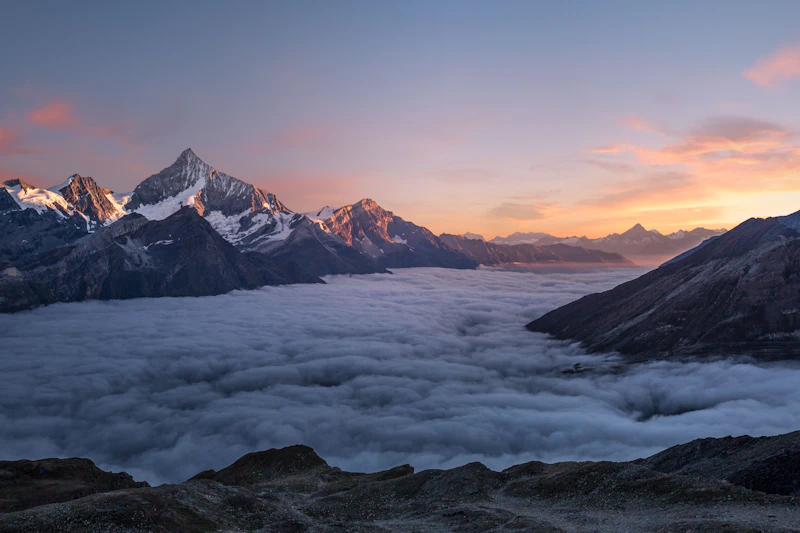
Discover the Alps
A four-day guided hiking experience through the Swiss Alps.
Image — left

Horizon Valley
Rolling hills and golden light, captured at dusk.
Image — right
Horizon Valley
Rolling hills and golden light, captured at dusk.
Image — bottom
Discover the Alps
A four-day guided hiking experience through the Swiss Alps.
Overlay
Discover the Alps
A four-day guided hiking experience through the Swiss Alps.
Pricing
Starter
For individuals and small projects.
5 projects
1 workspace
2GB storage
Community support
Pro
PopularFor growing teams who need more power.
Unlimited projects
5 workspaces
50GB storage
Priority support
Advanced analytics
Activity feed
Recent activity
- HWMerged
Haydn merged feat/dark-mode
2m ago
- JDOpen
Jamie opened Toggle animation lag
18m ago
- SRDeploy
Sara deployed v1.4.0
1h ago
- MKClosed
Mark closed Checkbox contrast bug
3h ago
Card props
| Prop | Type | Default | Description |
|---|---|---|---|
| noPadding | boolean | false | Removes default padding — useful for full-bleed images or tables. |
| children | ReactNode | — | Card content. |
CardTitle props
| Prop | Type | Default | Description |
|---|---|---|---|
| as | 'h1' | 'h2' | 'h3' | 'h4' | 'h5' | 'h6' | 'h3' | HTML heading element to render. |
CardImage props
| Prop | Type | Default | Description |
|---|---|---|---|
| src* | string | — | Image URL. |
| alt | string | '' | Alt text for the image. |
| position | 'top' | 'bottom' | 'left' | 'right' | 'top' | Controls rounding and layout. Use left/right with flex flex-row on the Card. |